
The strike-rate hover
Every strike-rate figure on the ratings is the tip of an iceberg. Hover it and you get the full record behind it, and the same numbers for every other angle at a glance.
The ratings carry strike-rate columns for the connections, the horse, the trainer, the jockey and the sire. Each figure is a summary. Hover it and the whole record opens up.
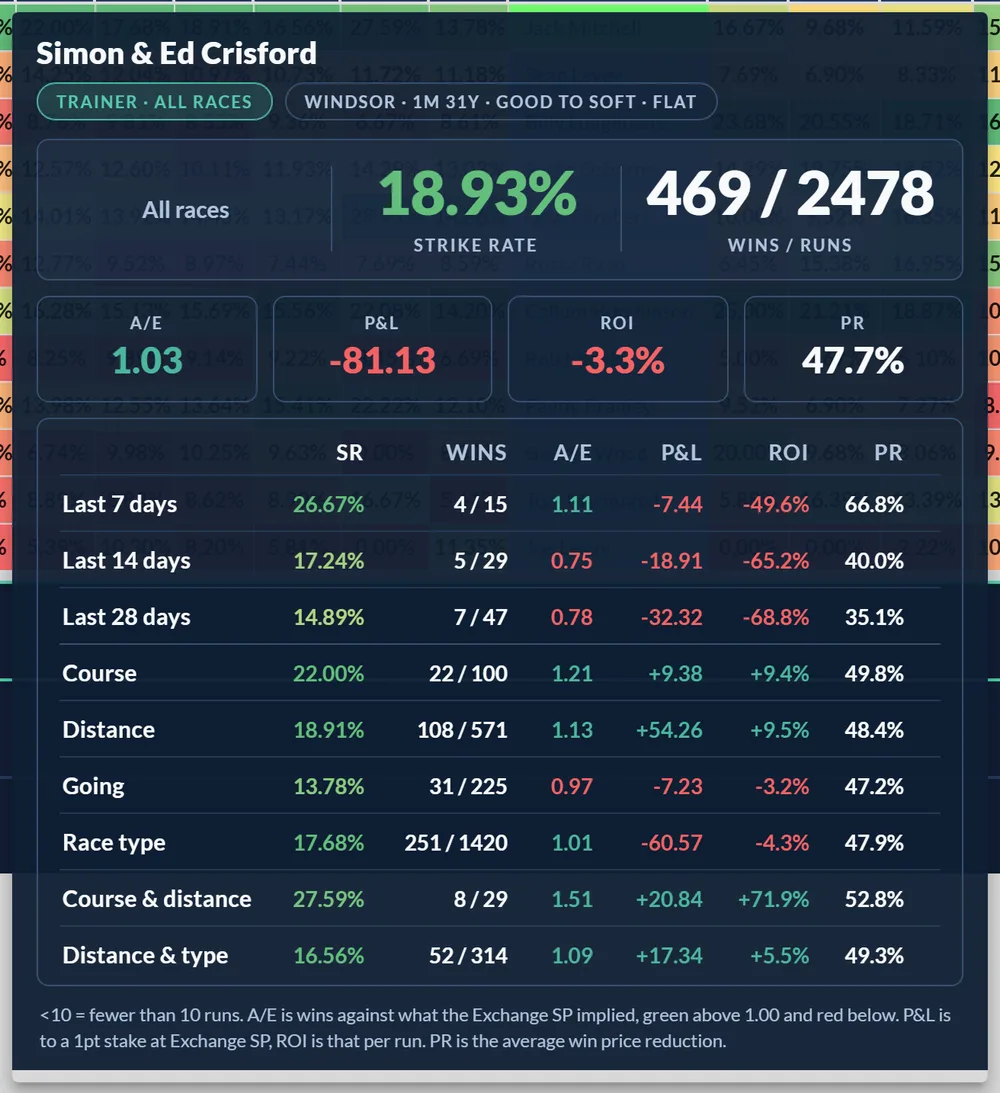
The hero, then the rest
The angle you're hovering sits at the top as a big card: its strike rate and its wins over runs. Below it, four figures put that strike rate in context:
- A/E: winners against what the market expected. Over 1.00 means the angle has beaten the market, not just landed short-priced winners. See What does A/E mean?.
- P&L: profit or loss to a 1pt stake at the exchange Starting Price.
- ROI: that profit as a percentage, per run.
- PR: the average price reduction, how far the win price shortened in running.
Underneath, a table repeats those columns for every other angle: the last 7, 14 and 28 days, the last 50, 100 and 200 rides or runners, this course, this distance, this going, this race type, course and distance together, and distance and type. One hover, the full picture.
Recent form, from a fortnight to 200 rides
The Recent form rows run from the last 7 days out to the last 200 rides. A hot fortnight and a long record answer different questions: a jockey can be 4 from 15 this week and still be losing money over 200 rides, and that is worth knowing before you back the streak. Jockeys and trainers are measured in rides and runners, sires in runners.
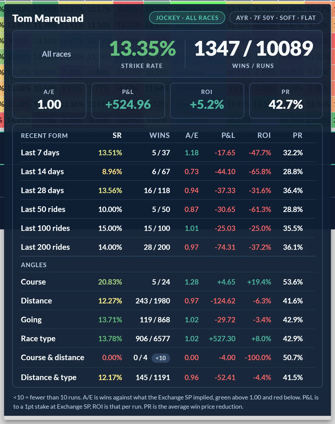
Reading the colours
The strike rates carry the same heat colour as the cell on the card, red through to green across the field, so a strong rate stands out. A/E is coloured too, green above 1.00 and red below. A small under-10 badge marks a record built on fewer than 10 runs, so you know when to take it with a pinch of salt.
What the numbers count
The hover follows your Stats View. In the default WS view every figure is a win strike rate; switch to PS and they become place rates; WP shows price reduction. See WS, PS and WP views explained.
If you don't want every figure, the Hover Stats Data action in the Tools menu lets you switch any of SR, Wins, A/E, P&L, ROI or PR off, so the hover shows only what you read.
Trainer form by month
A trainer's hover ends with one more section: the yard's record in the current calendar month over the last five years, set against its usual level, with a chip for each season and a twelve month strip. Jumps and Flat are kept apart. See Trainer form by month.
Was this article helpful?