
Alternative Colours
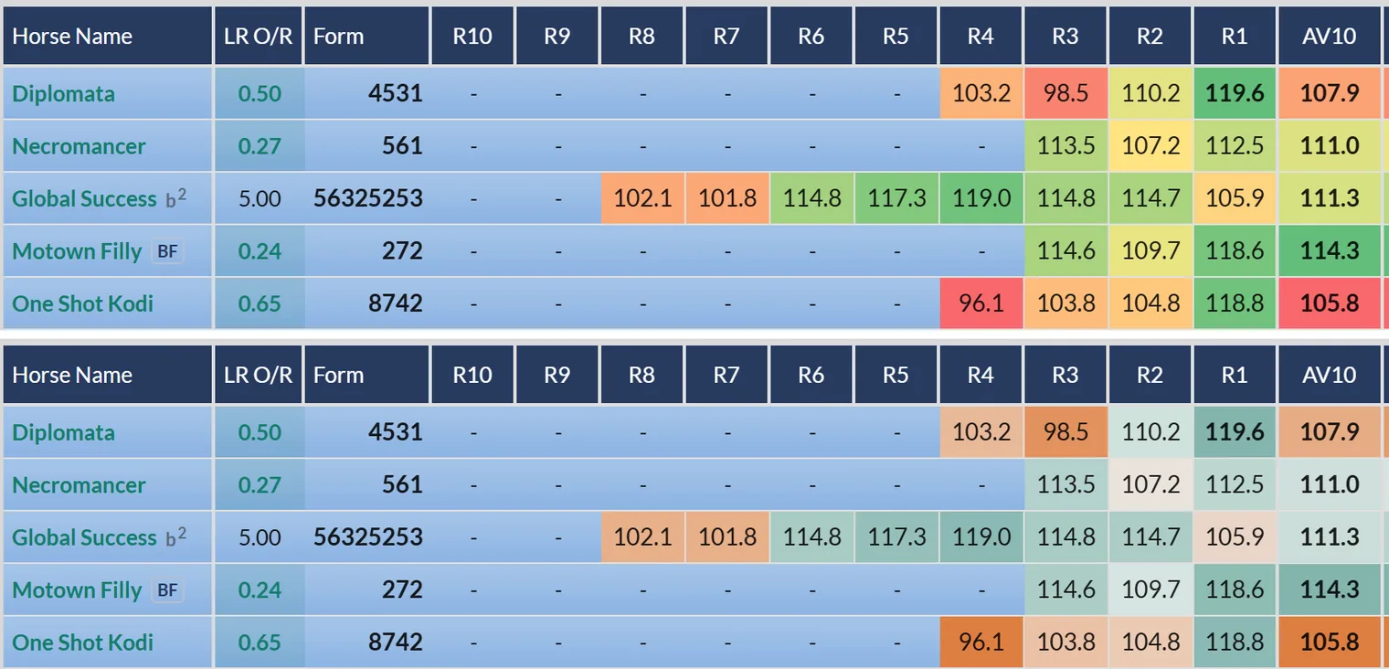
The ratings lean hard on red to green shading. Alternative Colours swaps that scale for orange to teal, so the colour coding works whatever your eyes do with red and green.
Our shading runs red to green: weak figures red, strong figures green. For roughly 1 in 12 men, red and green are hard to tell apart, which turns the most useful part of the card into noise. A member told us exactly that, so we built Alternative Colours.
Turning it on
Open Tools at the top of the ratings. Alternative Colours is the first switch in the Racecard section, at the top left.
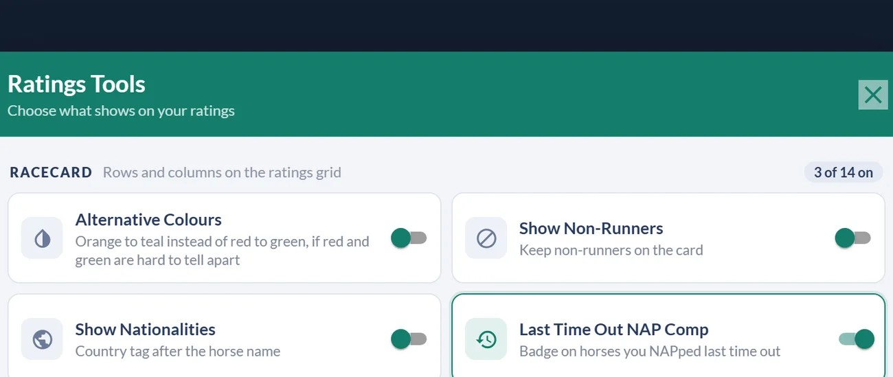
Switch it on and the whole card repaints from orange to teal, and every hover card is restyled to match, so you're never reading one scale on the grid and another in a pop-up. It's remembered on your device, and switching it off puts the original scale straight back.
Nothing else changes
Each step on the new scale keeps the brightness of the colour it replaces. That matters more than it sounds: the shading still reads as a ladder from weak to strong at a glance, the ranks and figures sit exactly where they did, and a card someone else describes to you still looks the same shape. It's the same information, in colours that separate.
Was this article helpful?